The tool currently only accepts XML data. The data must be prepared exactly as it would be for submission to COLLECT.
To use the tool drag and drop your five CSVs into the upload box on the main page and click submit. The tool may take a couple of minutes to process the data and display visualisations.
- Total cohort breakdown
- Total number of unique child IDs in the data, with breakdown by ethnicity, gender, and age.
- EHCs ceased within the past year
- EHC ceased with a date within a year of the reference date with breakdown by ethnicity, gender, age, and reason for ending.
- EHCs started within the past year
- EHCs started with a date within a year of the reference date with breakdown by ethnicity, gender, and age.
- Assessments completed within the past year
- Assessment outcome dates within a year of the reference date with breakdown by ethnicity, gender, age, and outcome.
- Closed assessment timeliness
- The distribution of time between assessment request being recieved and completion date, shown using box plots, with breakdown by gender, age, and ethnicity.
- This is calculated by merging module 1 and module 2 on "Person ID" and "Requests Record ID" to match rows, discarding empty rows, and finding time elapsed between request and outcome date.
- Currently open assessment timeliness
- Displays the distribution of timeliness for assessments with no outcome date with breakdown by ethnicity, gender, and age.
- Calculated in the same way Closed assessment timeliness, but only taking rows with no outcome date, and instead using the reference date.
- Requests in the past year
- Requests in the year (number of non-null rows in the requests made column), with further breakdown by ethnicity, gender, and age.
- Children appearing in lists multiple times
- Child IDs appearing multiple time in requests/assessments modules.
- Outcomes from requests journeys
- Visualisation showing the number of children having different outcomes at each stage from request to EHCP, with bars at each section showing distribution per section and bars between sections showing the distribution of children taking a given journey (the width of each bar representing the proportion of children having the exact same outcome at every stage). There is more info on this below.
- Open plan lengths
- The amount of time plans with no close date in the data have been open at the time of the reference date. The x-axis is the amount of time plans have been open, the y-axis is the number of children in each plan-length bucket.
- These charts are broken down by gender, age, and Ethnicity.
- Closed plan lengths
- These charts are the same as the open plan lengths, including gender, age, and ethnicity breakdown, with buckets shwoing the amount fo time between plans opening and closing.
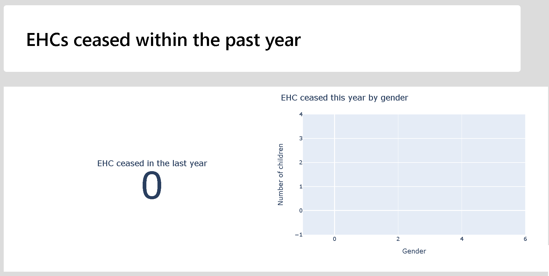
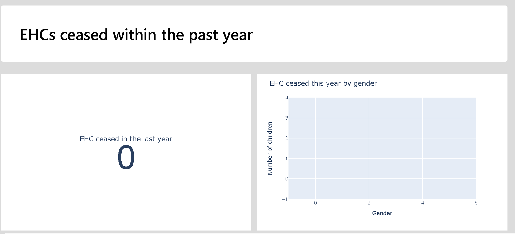
There are two ways to use the tool to make a report. The first is to use the tool in browser, picking visualisations as needed for your own reporting needs. Simply hover over each plot and use the save icon to save the plot and then bring it into your report. The second is to use the "Save as PDF" which appears after generating the report. This option takes a little time as generating PDFs is rather intensive computationally, so give it a few minutes. You may have to tell your browser to keep waiting for the page to respond a couple of times too. NOTE: because of how PDFs render, when using a particularly small screen the report formatting might be a little off when using the 'Save to PDF' button. If this is the case, simply zoom out your screen a little (this can be done in most browsers using ctrl + the minus key) and re-generate the report. You'll know if this has happened if the plot sides don't line up nicely with the title cards.
Incorrect zoom with small screen Correct zoom with small screen

Box plots are a useful way to visualise distributions of values. In box plots the upper and lower bounds of the box represent upper and lower quartiles, and the median is given by the line inside the box. The lines outside the box are the highest and lowest values not considered to be statistical outliers. Points displayed outside of these lines are statistical outliers. See more on the box plots used here.
The journeys chart shows the breakdown of children from assessment request to outcome. The sections of the chart reflect the column names in the modules, and the value given at each section is the value in the column it represents. For instance in request outcome, the Y section is children who have made a request for an assessment and have been granted an assessment. Each of these column sections shows the distribution of children with each outcome. From the left to the right, to each column section, you can see the bars between them showing how many children move from outcome to outcome. Each of these is sized according to the number of children who take a given journey of outcomes. As an illustration lets say that 75 children might have a Y for their request outcome, but only 40 of these have a completed assessment, and then only 30 of those have an EHCP. In this case, from the Request section bar of 30 would go across to Request Outcome "Y", Assessment Complete "Assessment Completed", and Assessment Outcome to Issue EHCP "Y". Its size then is all of the childrne who take a particular journey. That set of 75 children with a Request Outcome "Y" may be split into smaller bars including those who have not got a completed assessment but dont have an ECHP, and another bar of those hwo have not got a completed assessment and then cannot have an assessment outcome.
As the tool is still in development, if you have any unflagged errors, or the tools seems to be taking multiple minutes to run, the developer console it a good place to start looking.
A guide on how to access the developer console in multiple different browsers can be seen: here.